Little Village Chamber of Commerce
✶Promote✶
Challenge
- Original Logo difficult to read, costly to reproduce.
- Original Logo audience could not identify with logo.
- Original Logo Color scheme was reflective only of Mexico.
- Original Logo had no tie-in with Chicago.
Results
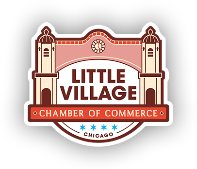
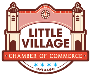
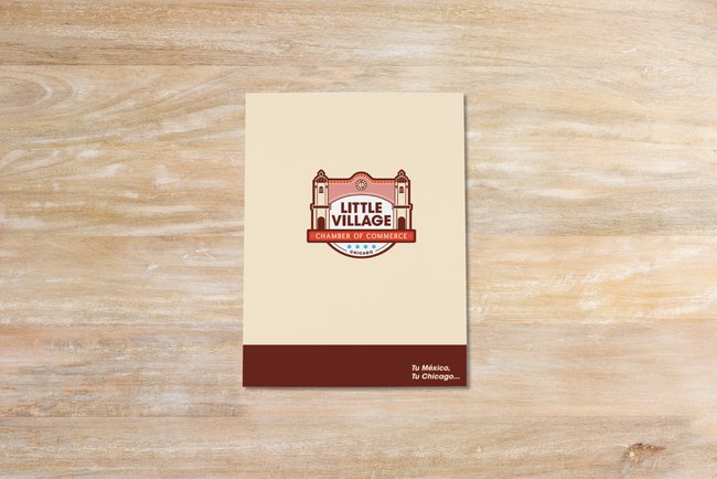
- LVCC logo embodies the cultural spirit of Mexican heritage.
- The earth-tone palette symbolizes “Tierra Patria.”
- The terra cotta archway is an inviting gateway to the “Tu México, Tu Chicago” authentic Mexican experience.
- “Little Village” font reinforces the community’s foundation, welcoming visitors through the National Landmark iconic arch.
- “Chamber of Commerce” providing structural support.
- The “Relojes Centenario” vintage clock highlights the binational ties with México.
✶Branding Hub Program Deliverables✶
Strategy | Brand Identity | Content Design | Production
0
Members0
Residents0+
Small BusinessesBrand Identity System

Before
After
Color Schematics
Brand Patterns


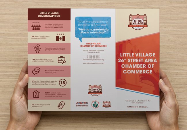
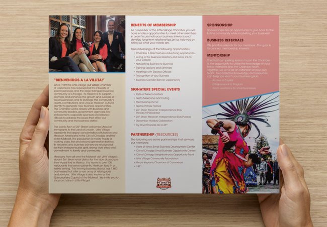
Print Production



Website Design & Development

Additional Creative Assets


“The new logo meant a fresh new start for the Chamber (taking the chamber to a new era), and when choosing a logo, it needed to have a unique design, something more modern (clean) than our previous logo, something that the new generation can relate to, but at the same time keep that unique culture identity to it as we are known in our community. Four Star Branding understood our vision and helped us put that unique Mexico cultural welcoming touch to our logo, but also representing Chicago with the blue stars. Tu Mexico, Tu Chicago!”
Blanca R. Soto
Chief Operating Officer, LVCC
