Midland Builders
✶Empower✶
Challenge
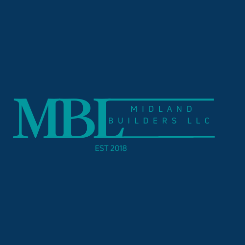
The original Midland Builders was a typographical treatment of the acronym MBL, with an extension of the L encompassing the entire company name in two tones of blue.
Results
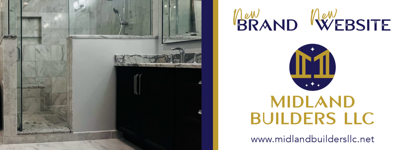
Midland Builders' new rebrand was inspired by Sergio, the owner and entrepreneur. Sergio wanted a constellation touch in association with his family structure and his favorite colors: blue, white, and orange. The gold structure and pillars symbolize the rudimentary structure of a building, and the typeface has a futuristic touch.
✶El Poder de la Marca® Deliverables✶
Brand Identity System | Website Design & Development | Social Media Creative Assets
Before

After
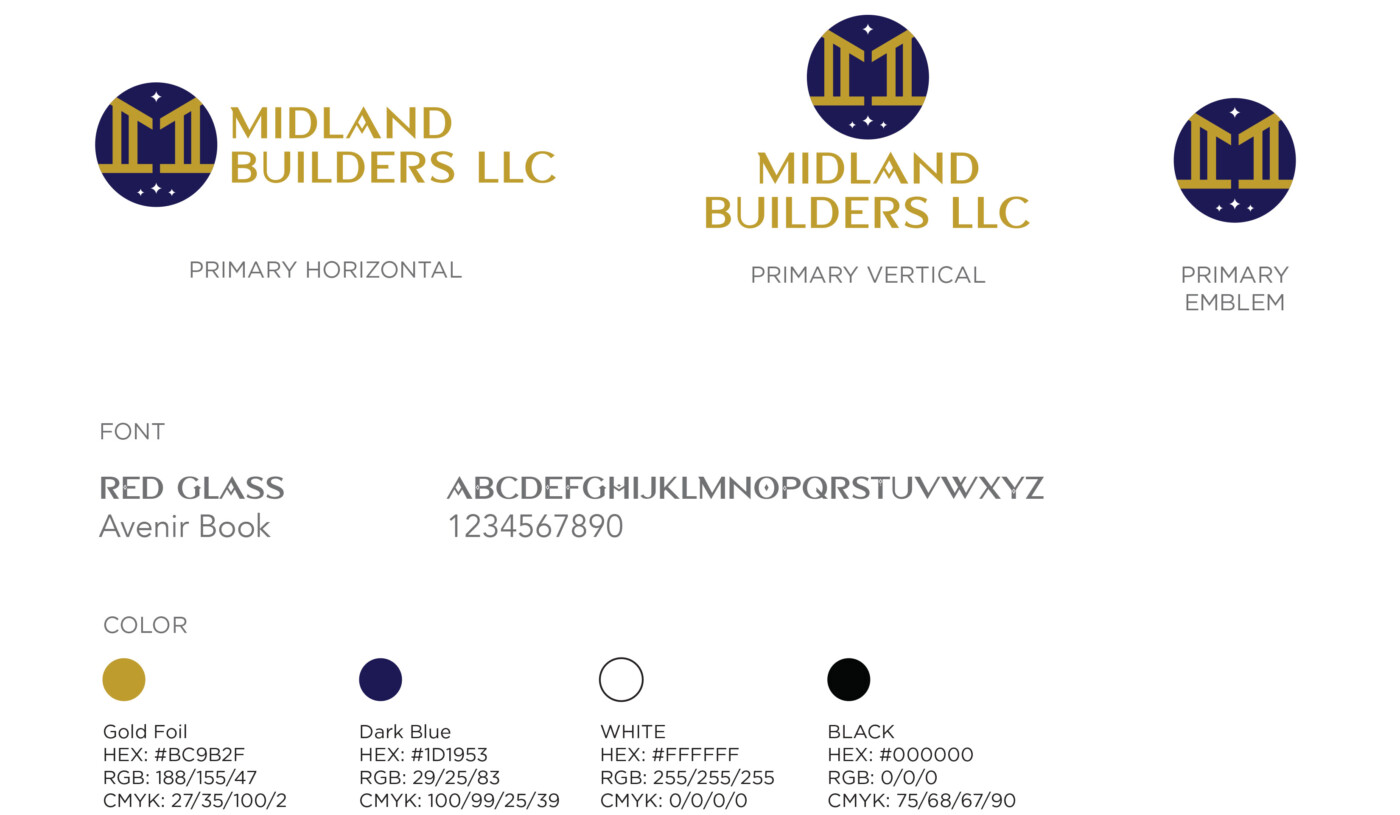
Brand Identity System
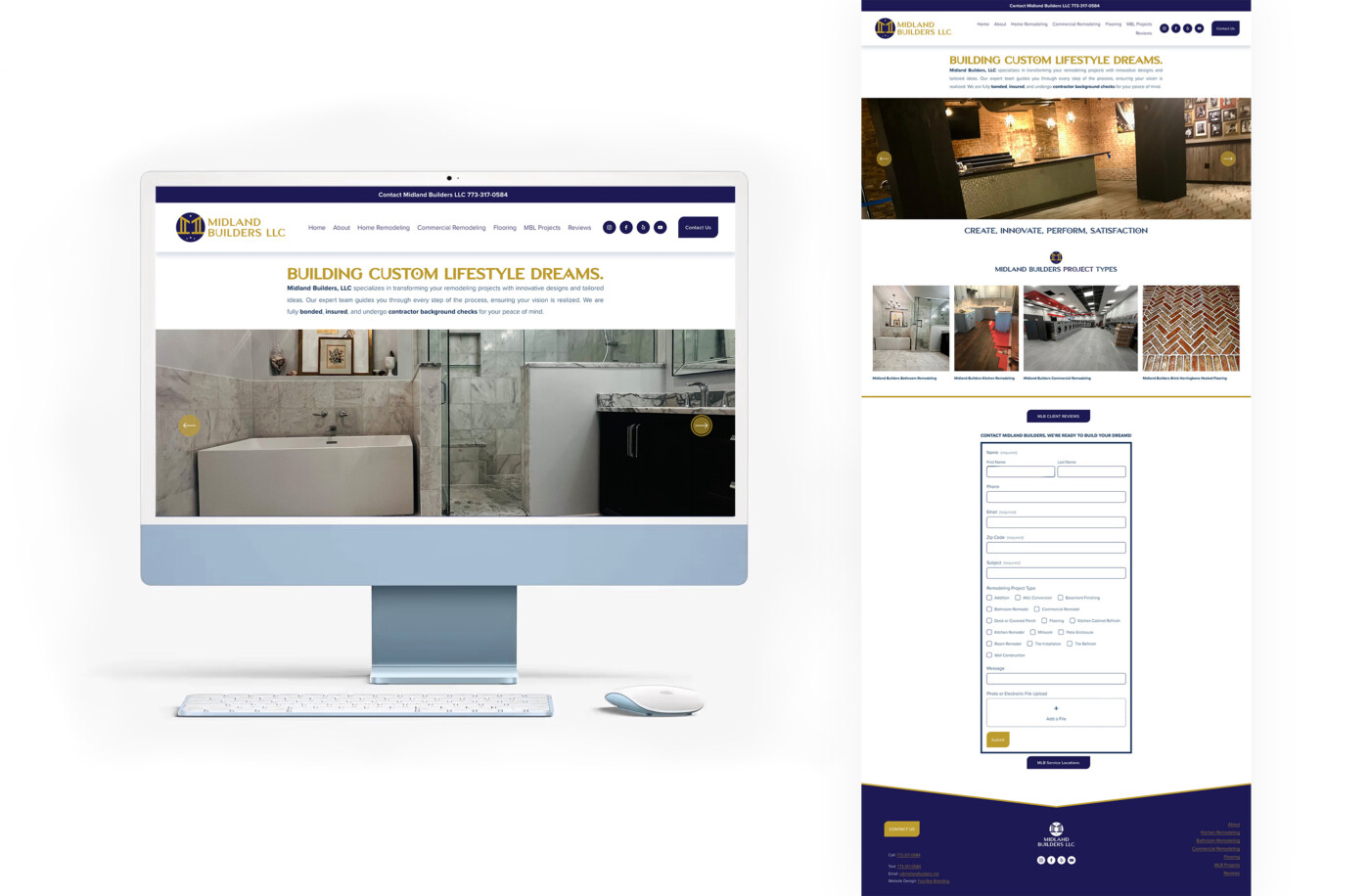
Website Design & Development
Social Media Creative

“Quote"
Name
Owner of Midland Builders
