Environmental Analysis Inc.
✶Ignite✶
Challlenge
EAI founded the original logo in 1994 and had a historically significant meaning to the entrepreneur business owner, Sara Muñoz-Abramowicz, President & CEO. However, it needs a EAI brand refresh.
Results
Listening to Sara’s input, we retained the circle signifying recycle/environmental systems. The EAI wave represents interlocking movement between environment and analysis. Collateral data materials were designed and simplified for easy client accessibility.
Tagline: Because We Put the EAI in Reliability
✶Branding Hub Program Deliverables✶
Strategy | Brand Identity | Content Design | Production
Brand Identity System

Before
After


Color Schematics
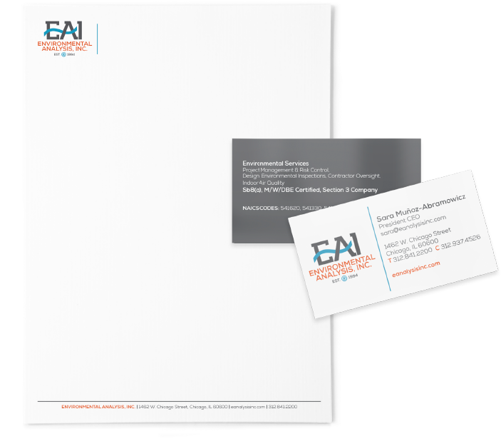
Print Production
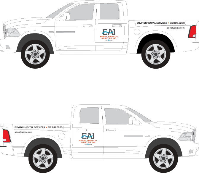
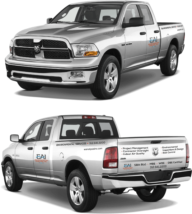
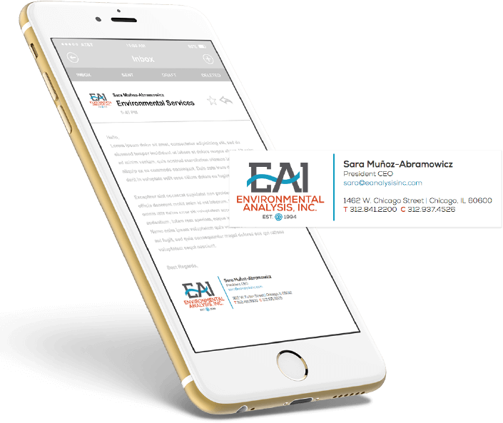

“FourStar has given EAI a professional logo that anchors its company brand & becomes the most visible manifestation of the company. If you build a great experience, customers tell each other about that.”
Sara Munoz-Abramowicz
President & CEO of EAI
